CONTRAST HARMONY POSTER
I designed a poster for a fictional event with the overarching theme of contrast and harmony. The specific words I used were “bold” and “subtle.”
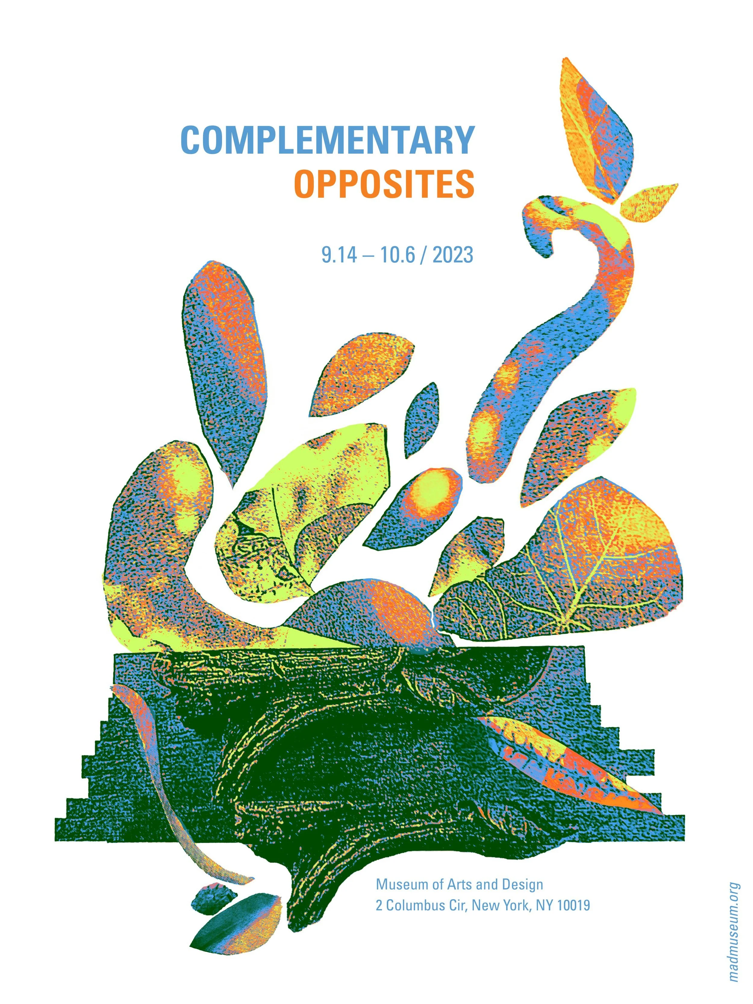
This poster was intended to be printed in a large scale, so I wanted to make it eye-catching from afar, and for the necessary information for the event, such as title, location, and time, to become legible once a viewer walked closer.

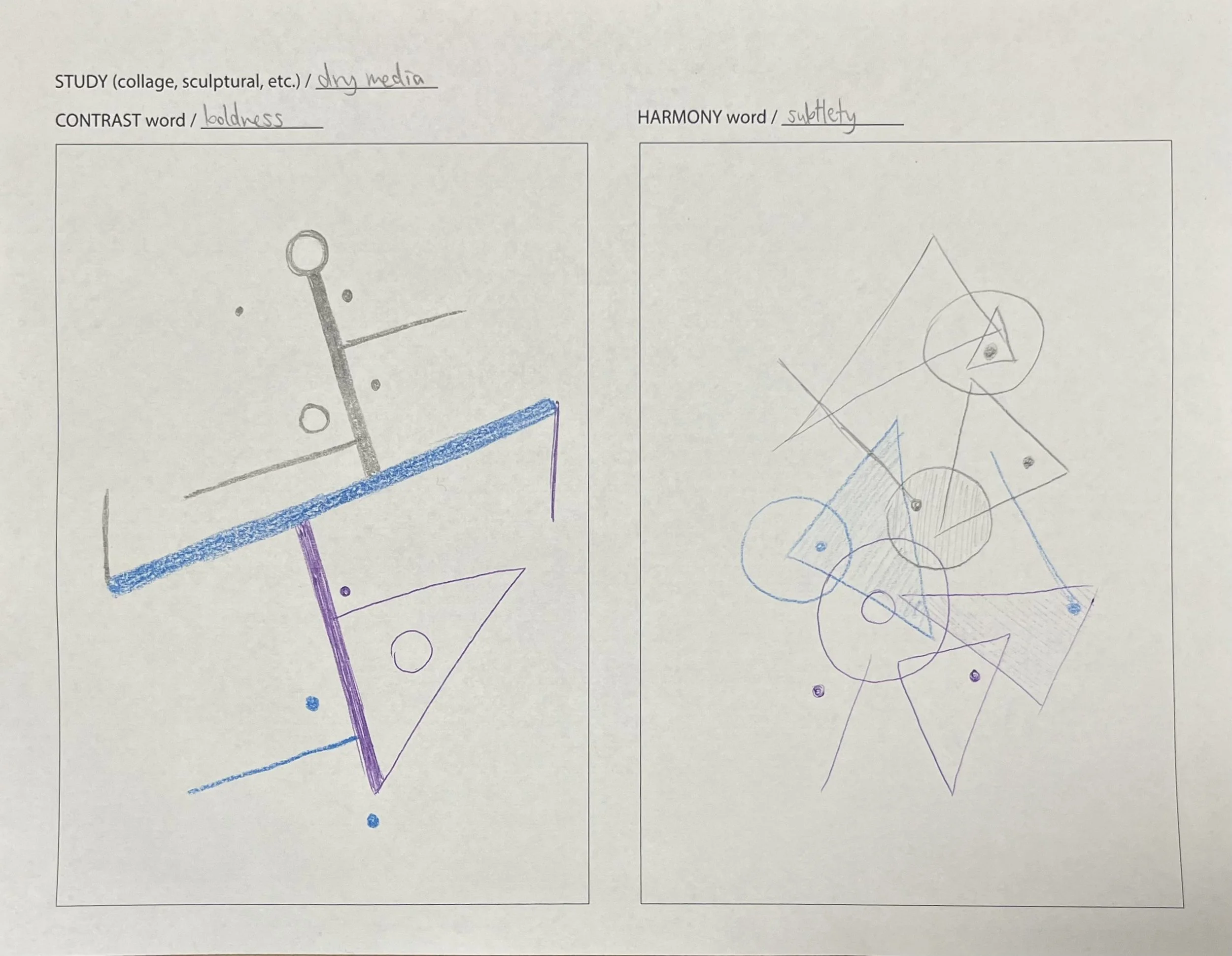
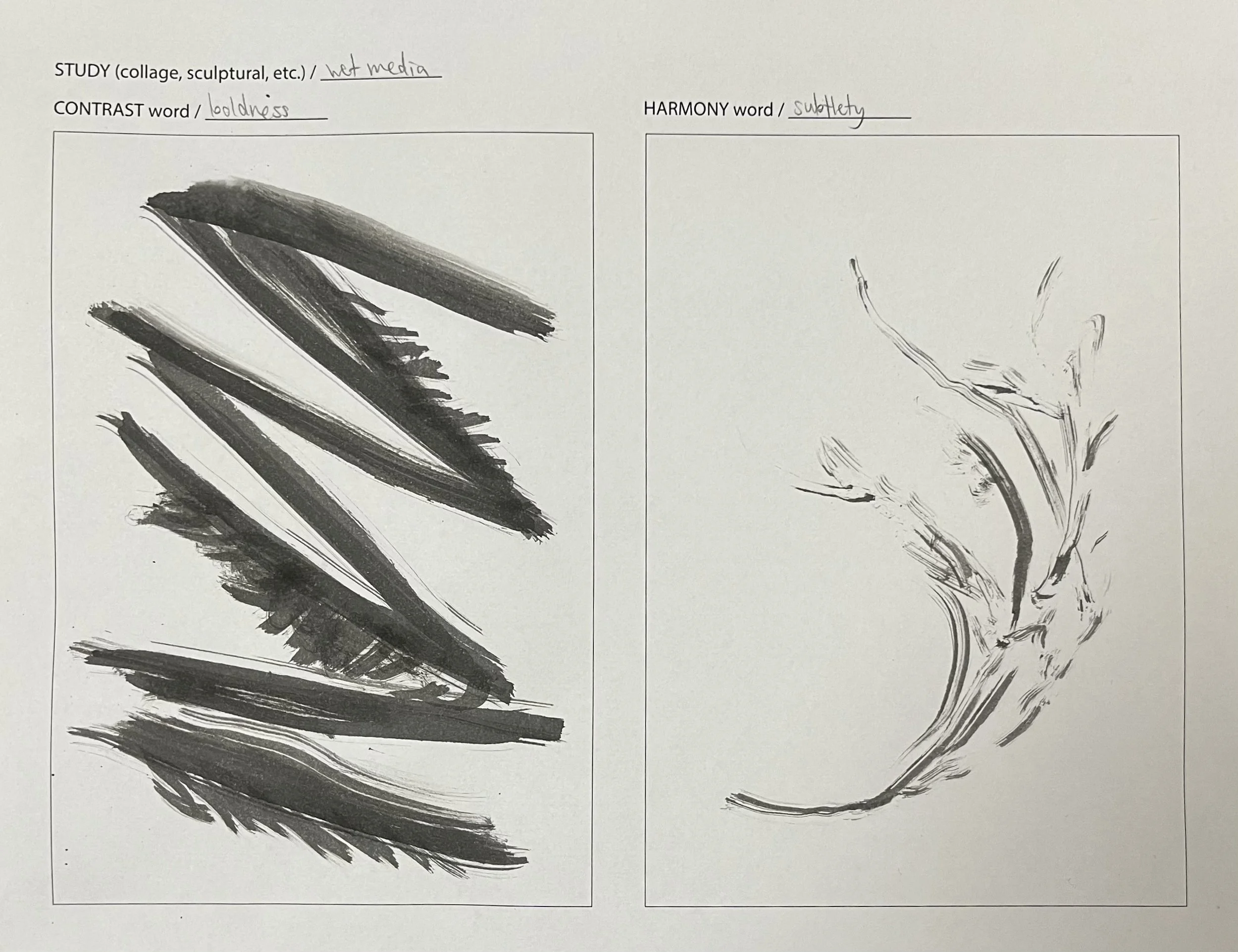
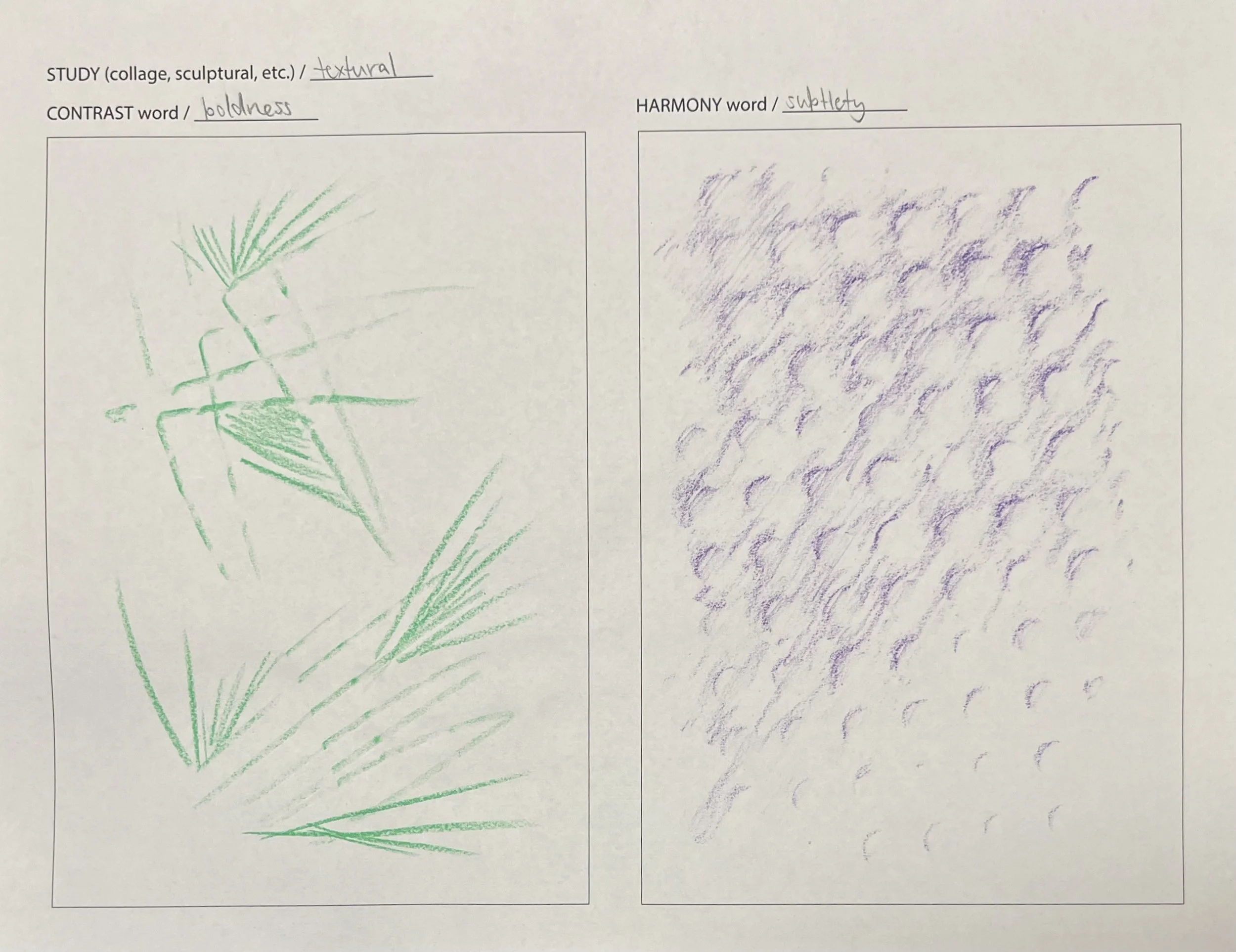
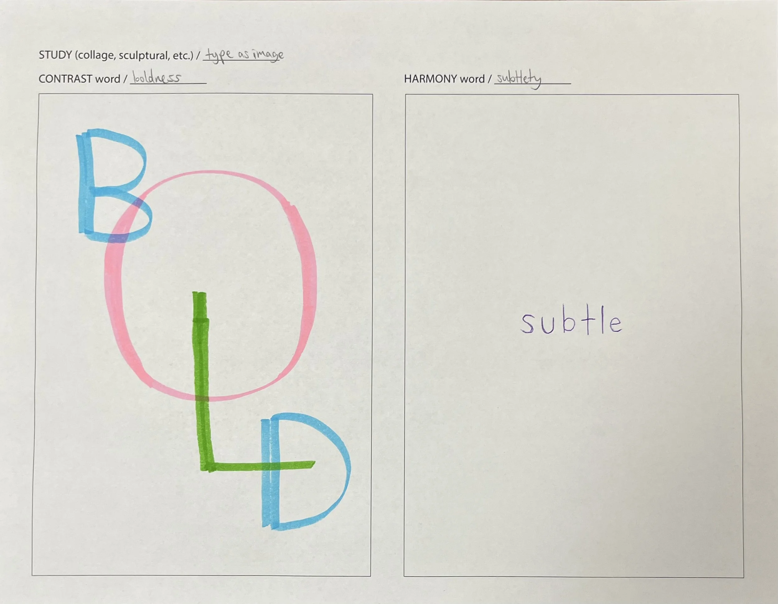
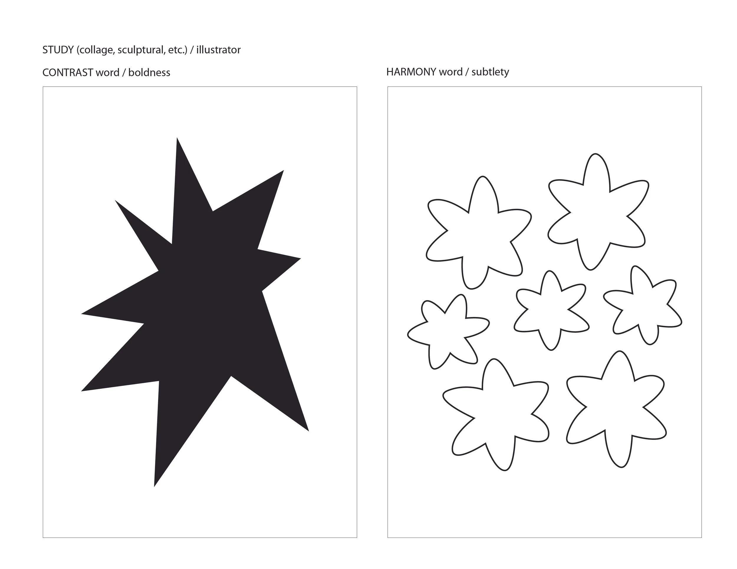
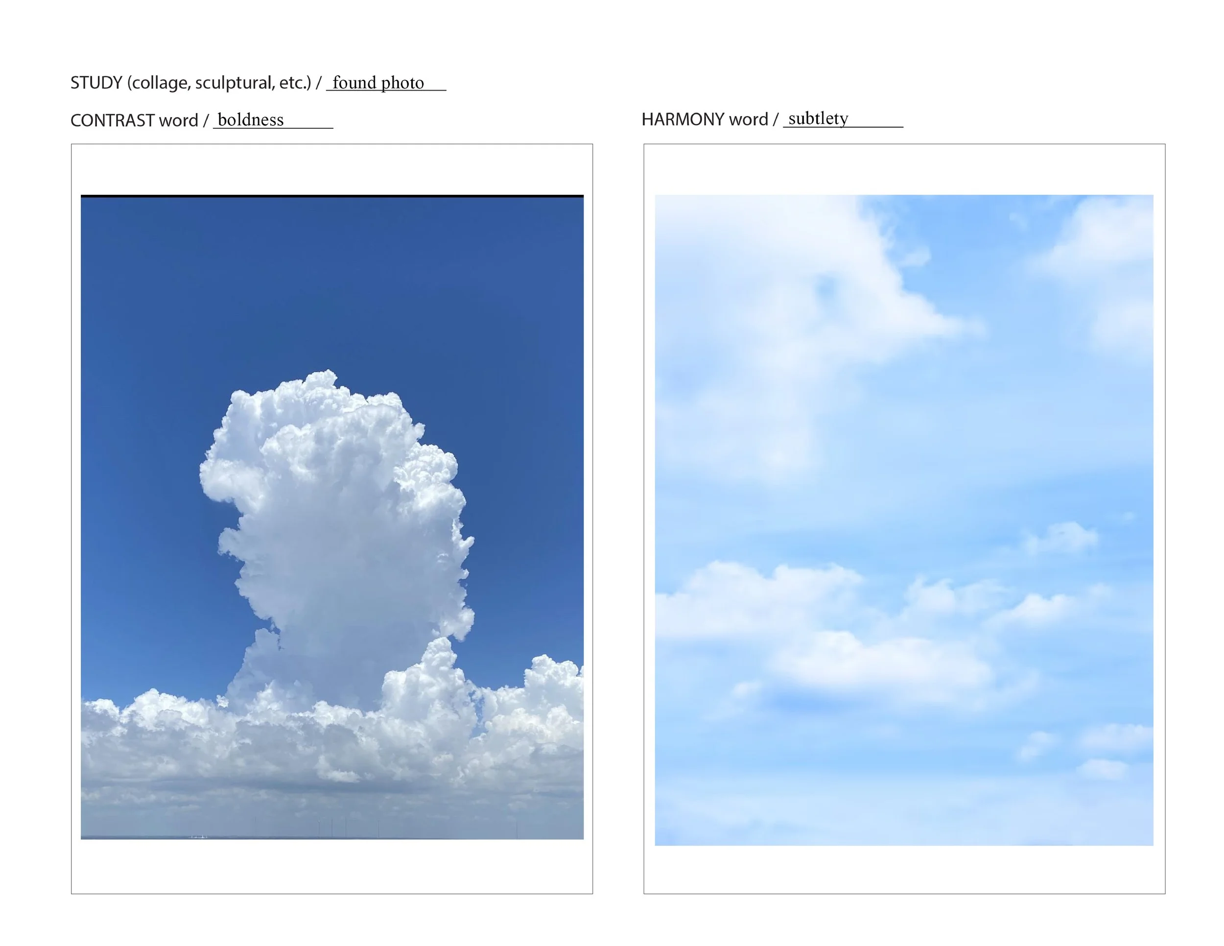
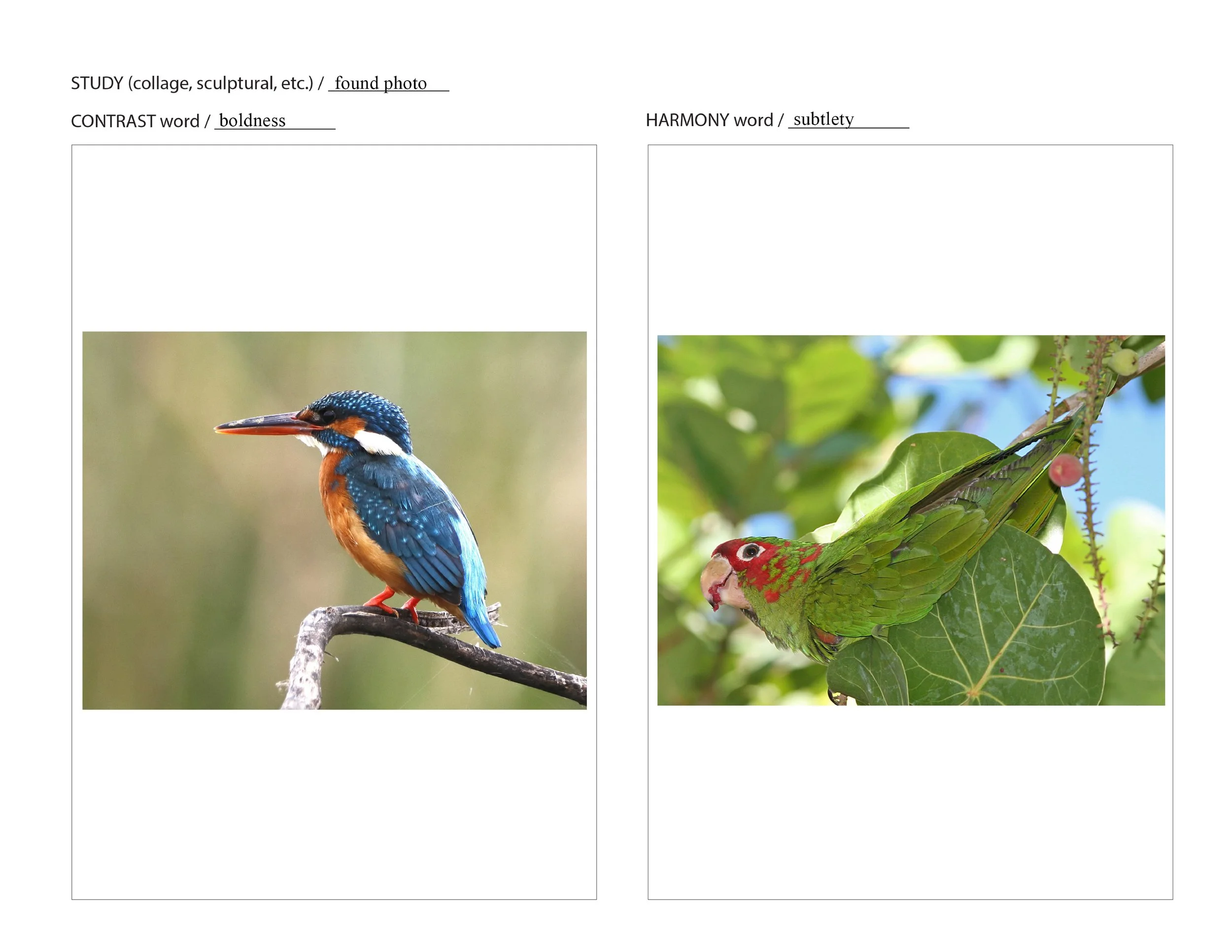
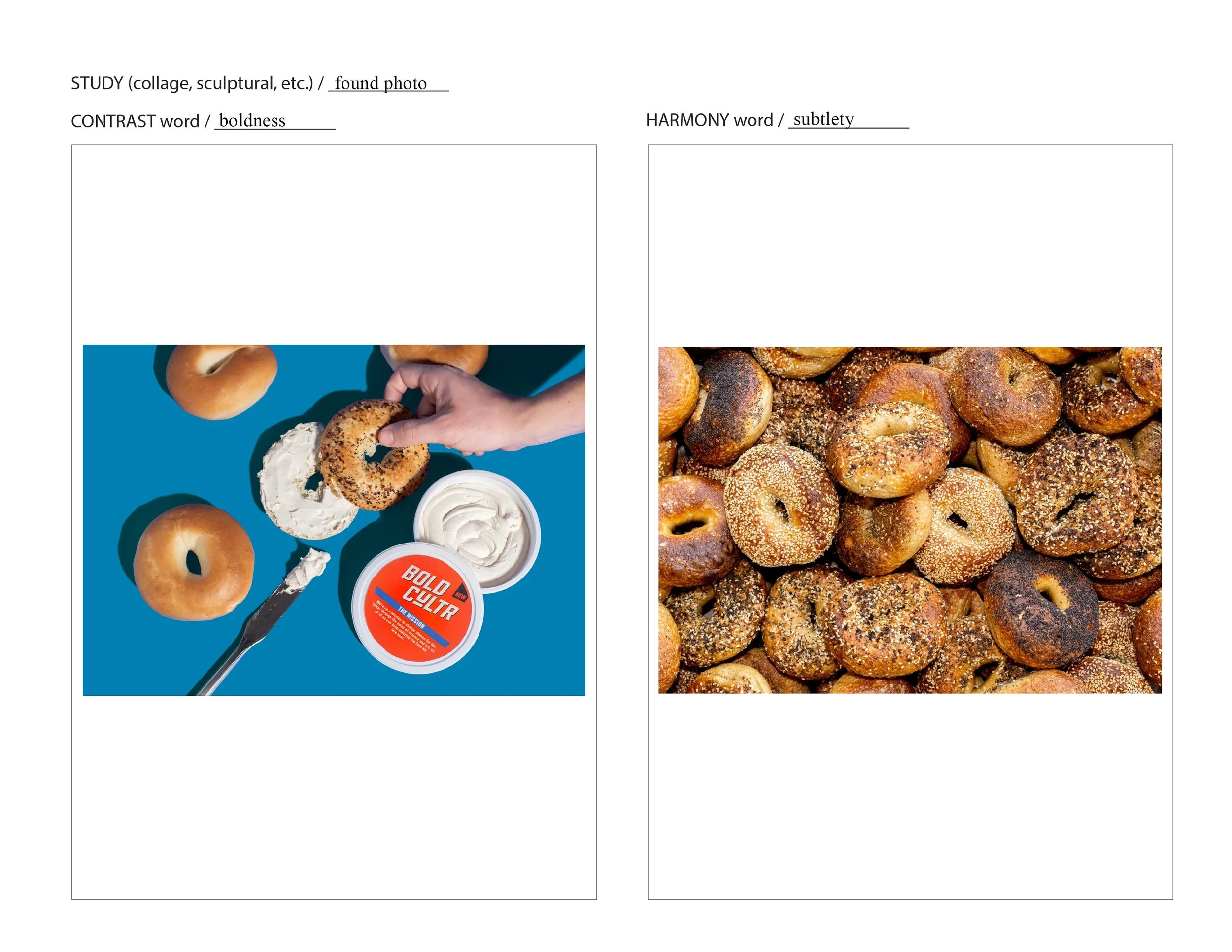
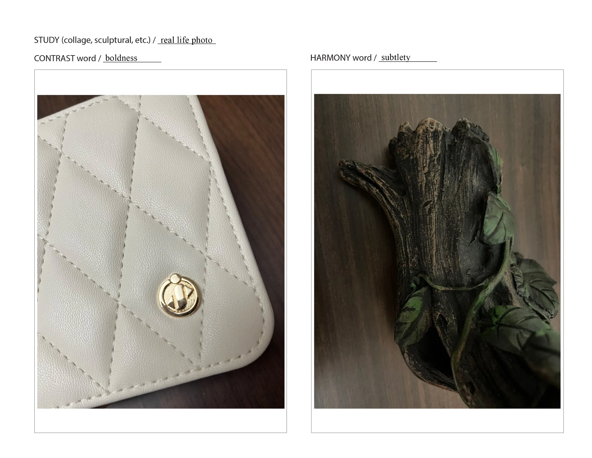
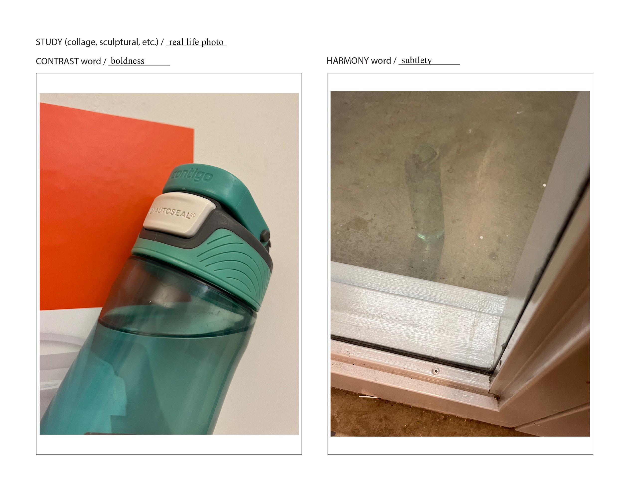
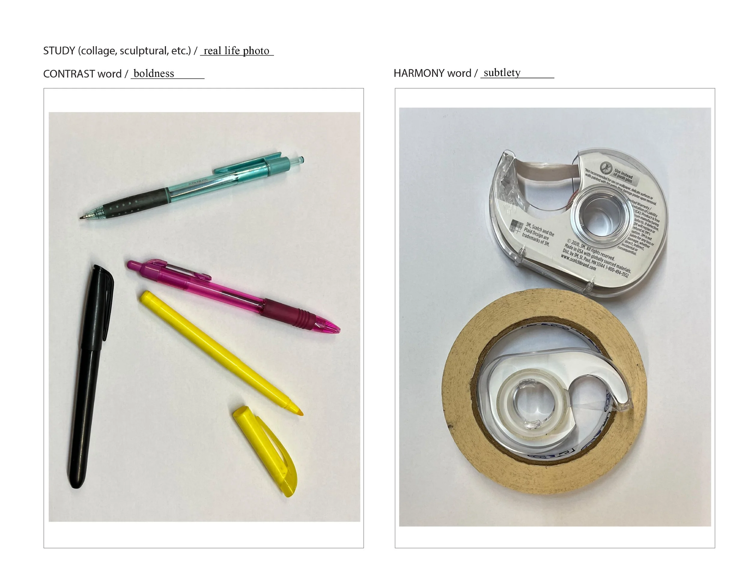
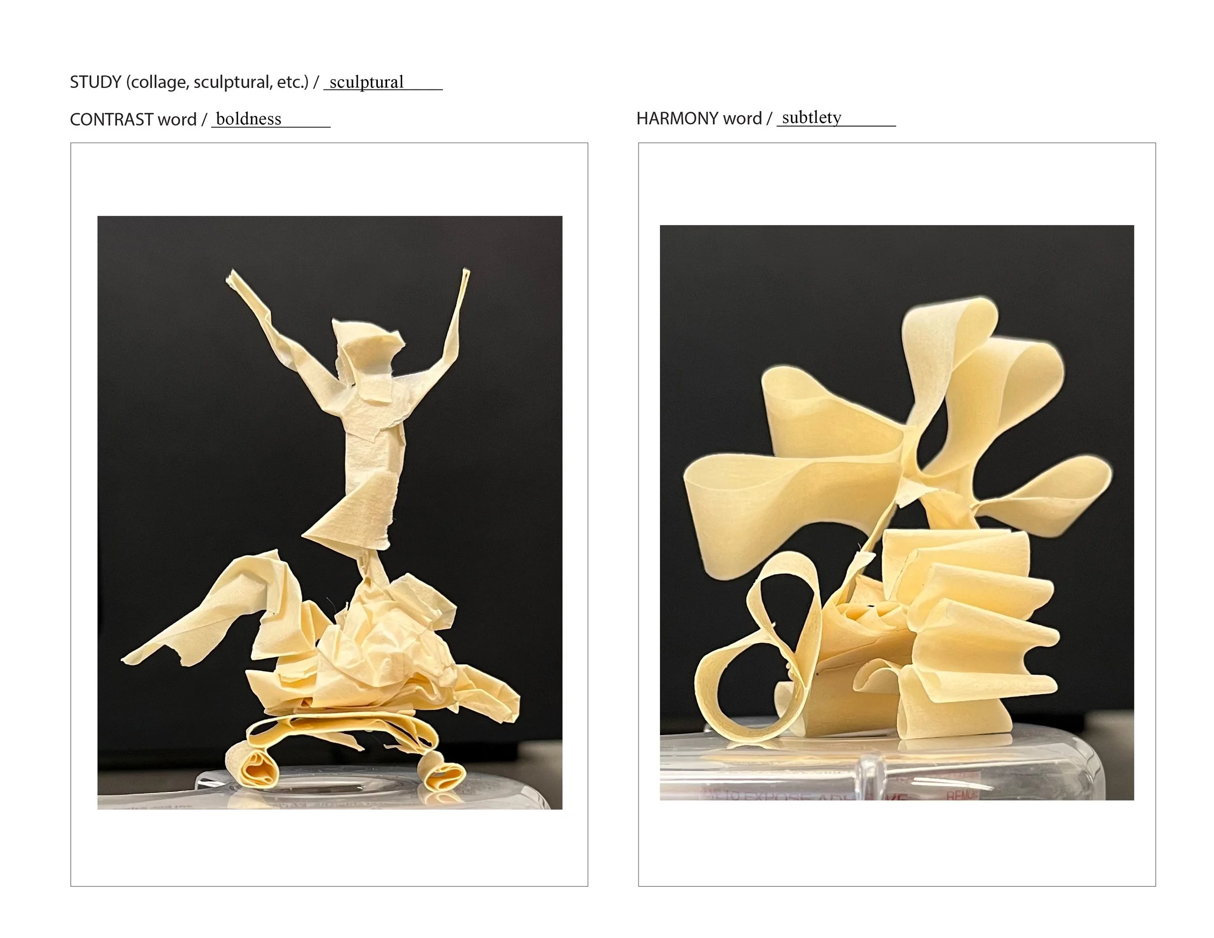
First, I explored various mediums and ideas (including traditional materials, photo, sculpture, and collage) to try to capture the concepts of boldness and subtlety. In each medium, boldness is on the left and subtlety is on the right.
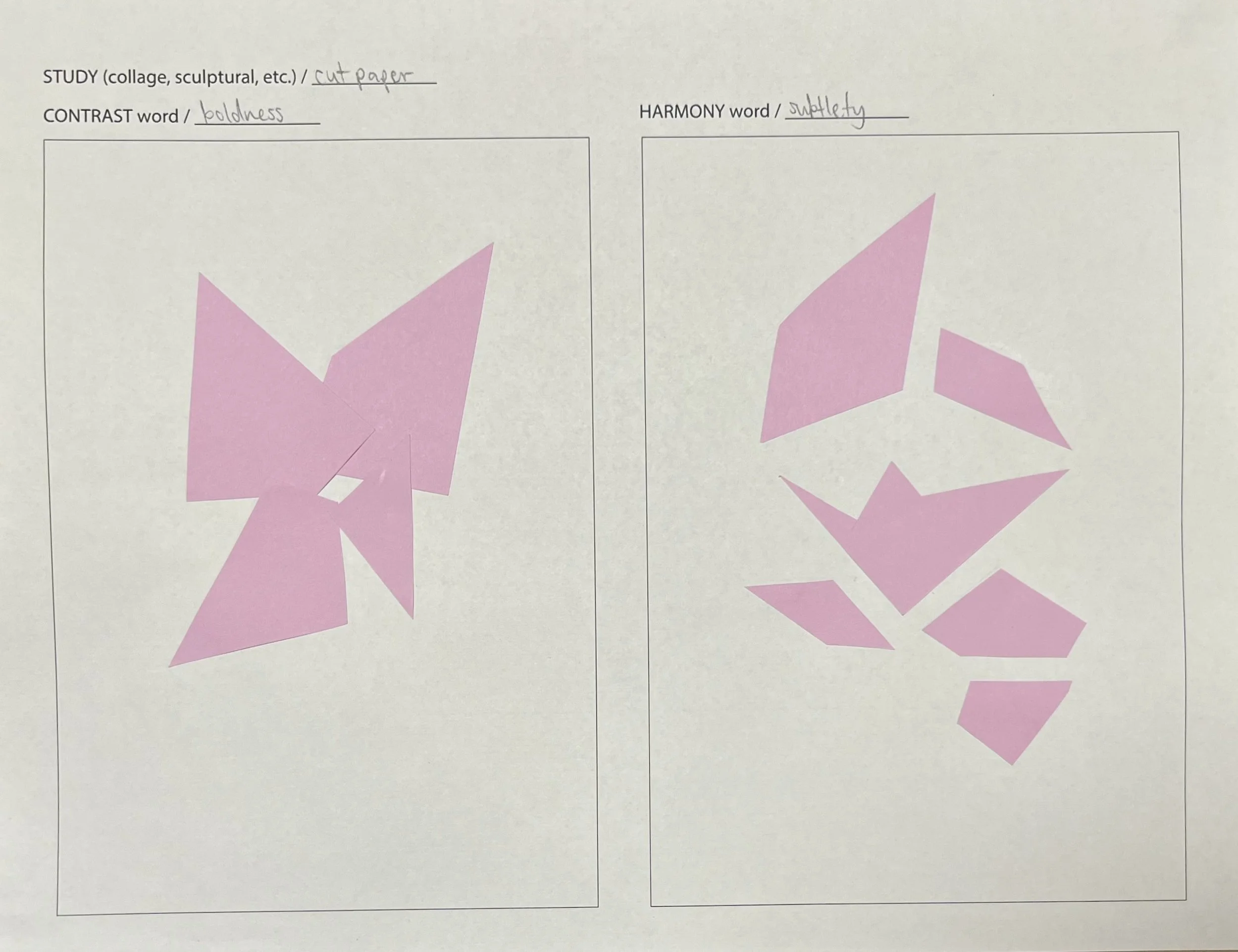
For the collage experimentation, I started out by printing out parts of the other explorations and putting them together physically. Then, I scanned it and began editing digitally. Finally, I printed the digital versions out again and added more physical elements.
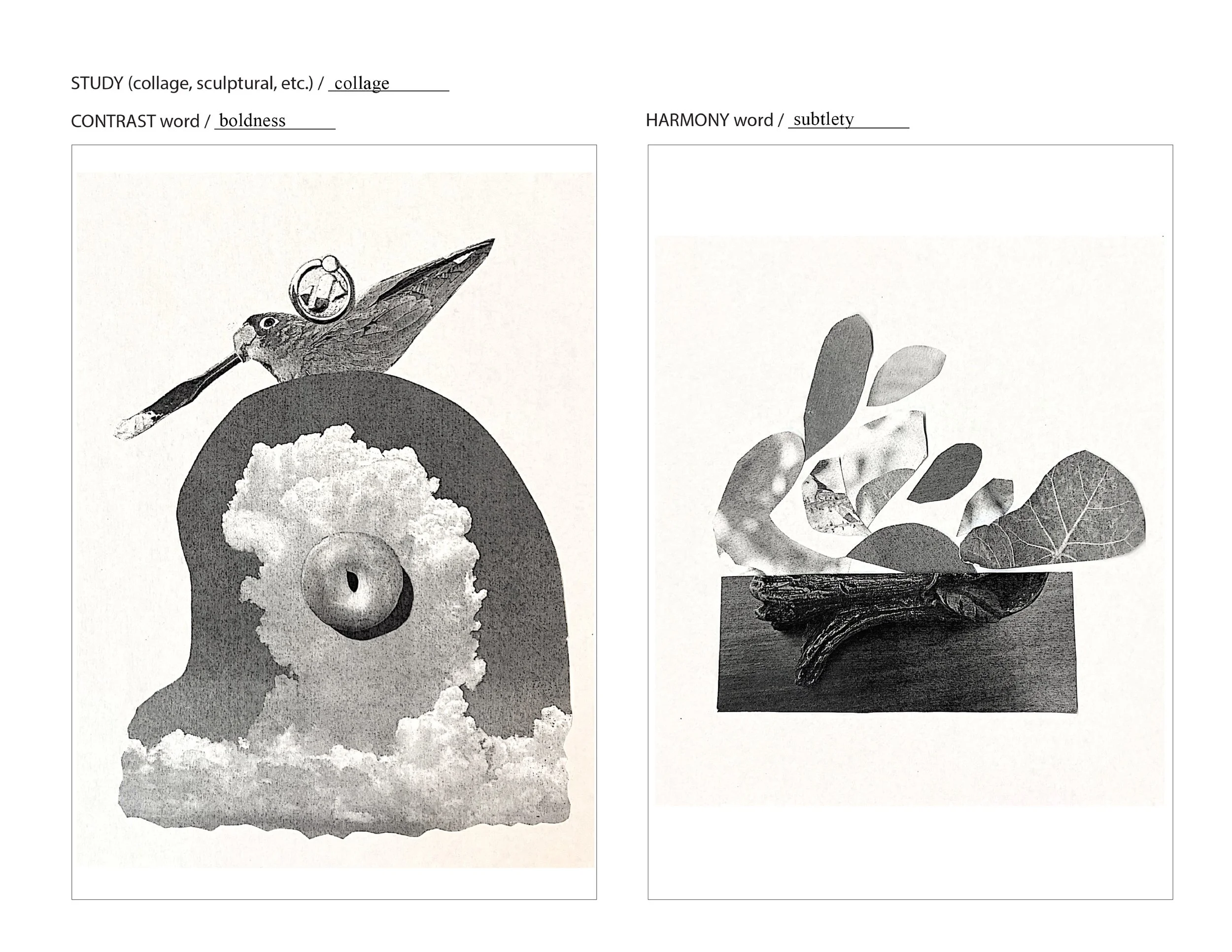
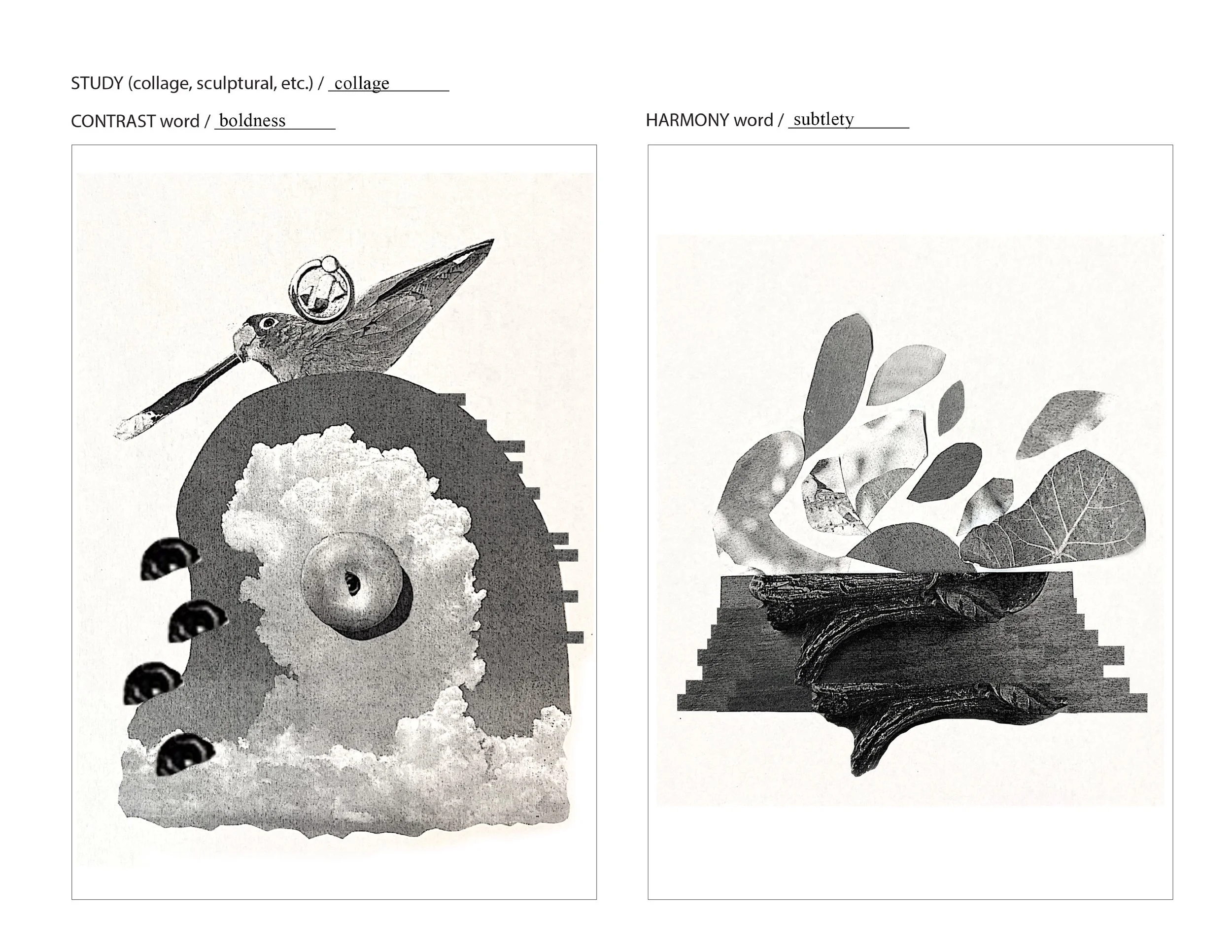
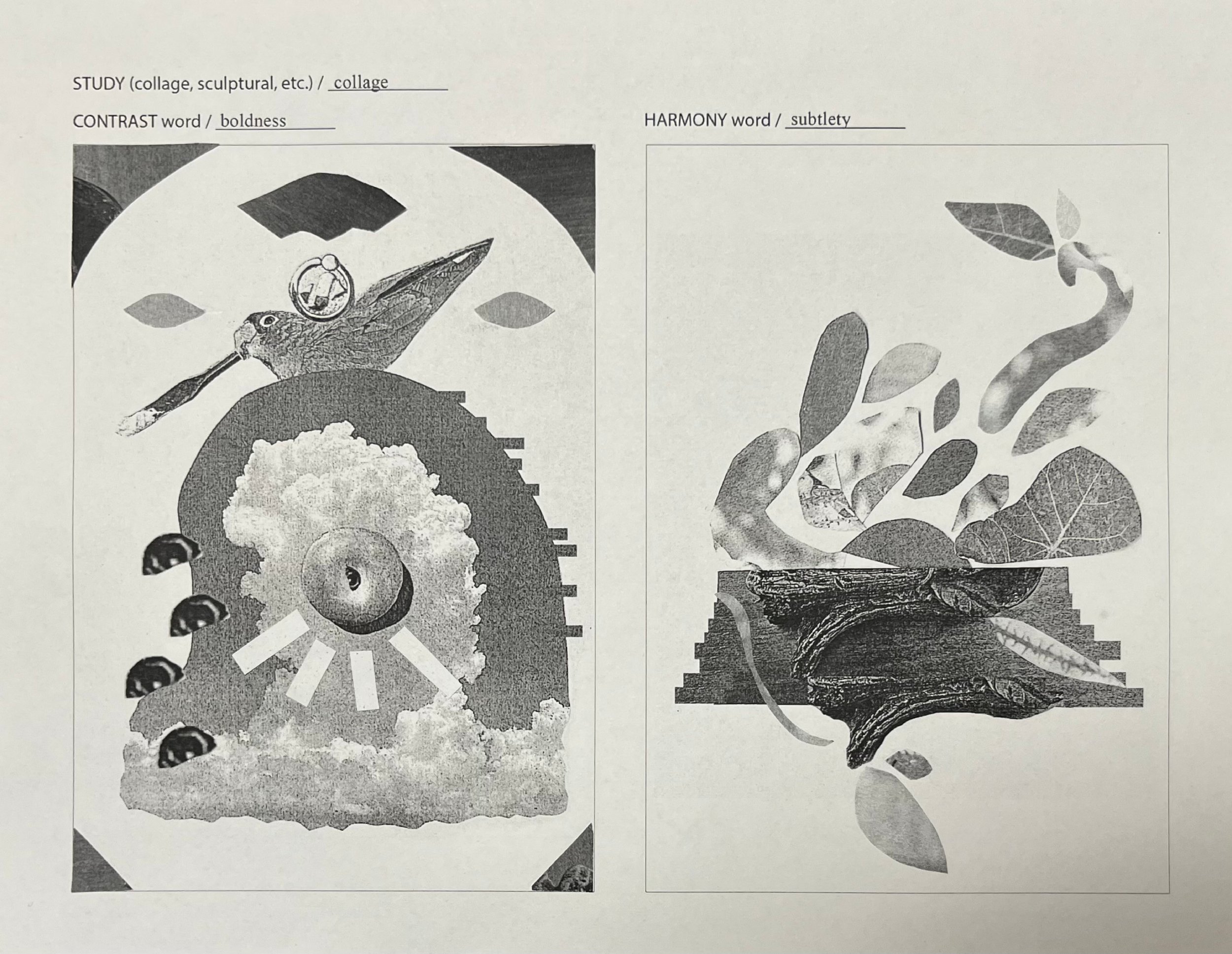
Out of all the explorations, I found the final collage for subtlety to be the most compelling one, and the one that captured the idea of contrast and harmony the best. I brought it into Photoshop, made some tweaks, and played around with gradient mapping.

Next, I added typography to communicate the necessary details of the poster. In line with the concepts of boldness and subtlety, I wanted the typography to be simple, yet striking.
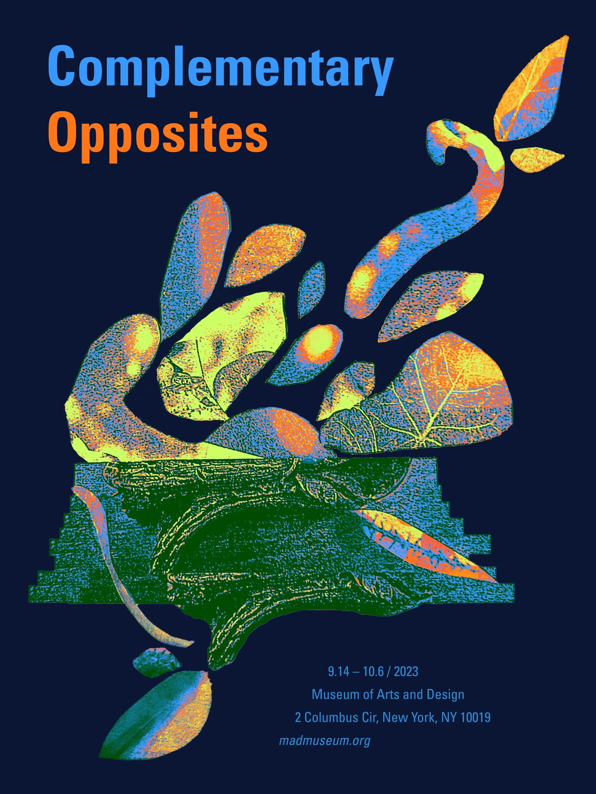
I considered both light and dark backgrounds, but I eventually chose the light background so that the text would be more easily readable.
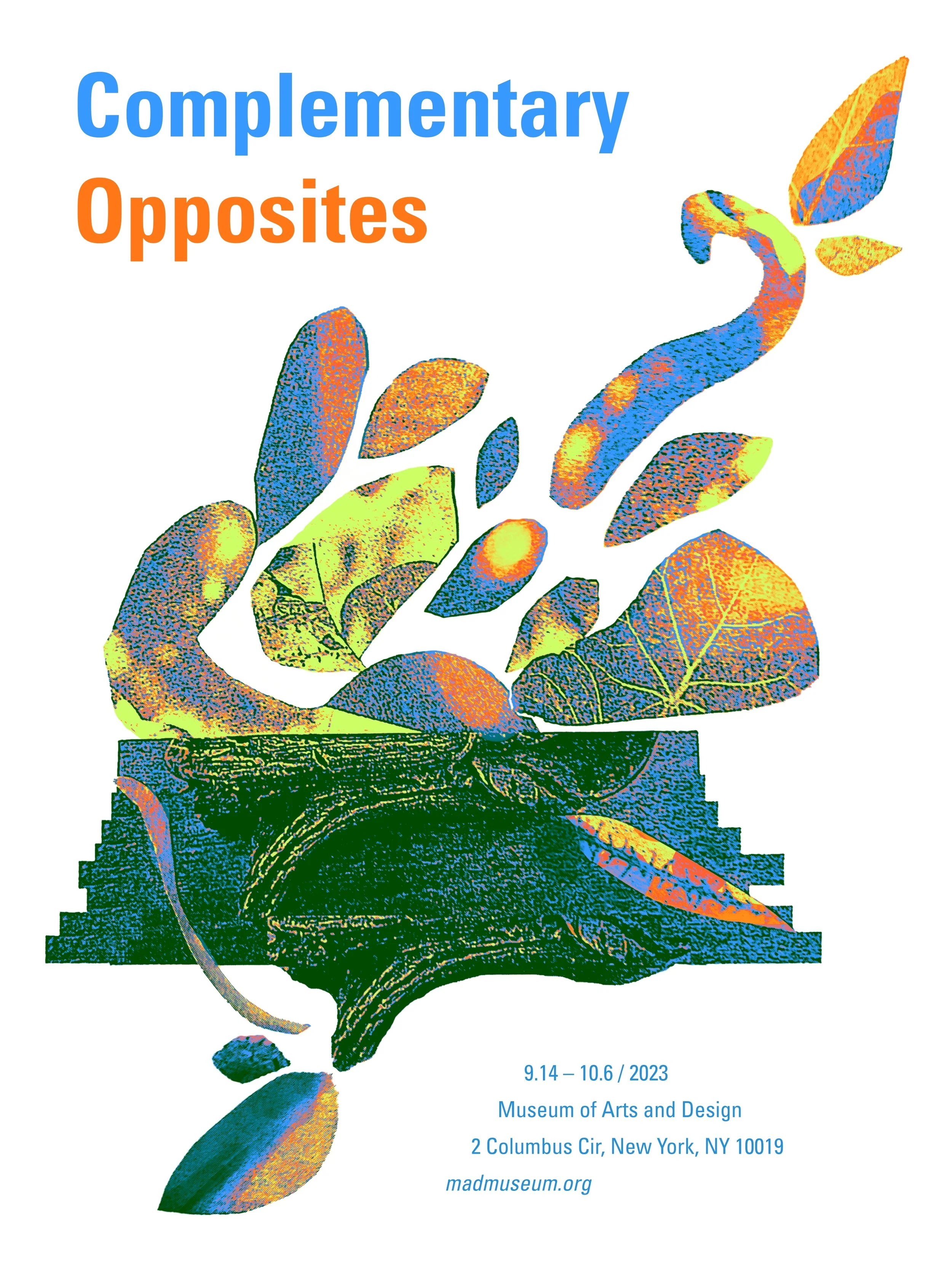
Finally, I adjusted the typography to be more subtle, so that it would not compete for focus with the collage graphic. Additionally, I adjusted the graphic to wrap the title and bring the viewer’s eye back to the center of the composition.