ICON/INDEX/SYMBOL
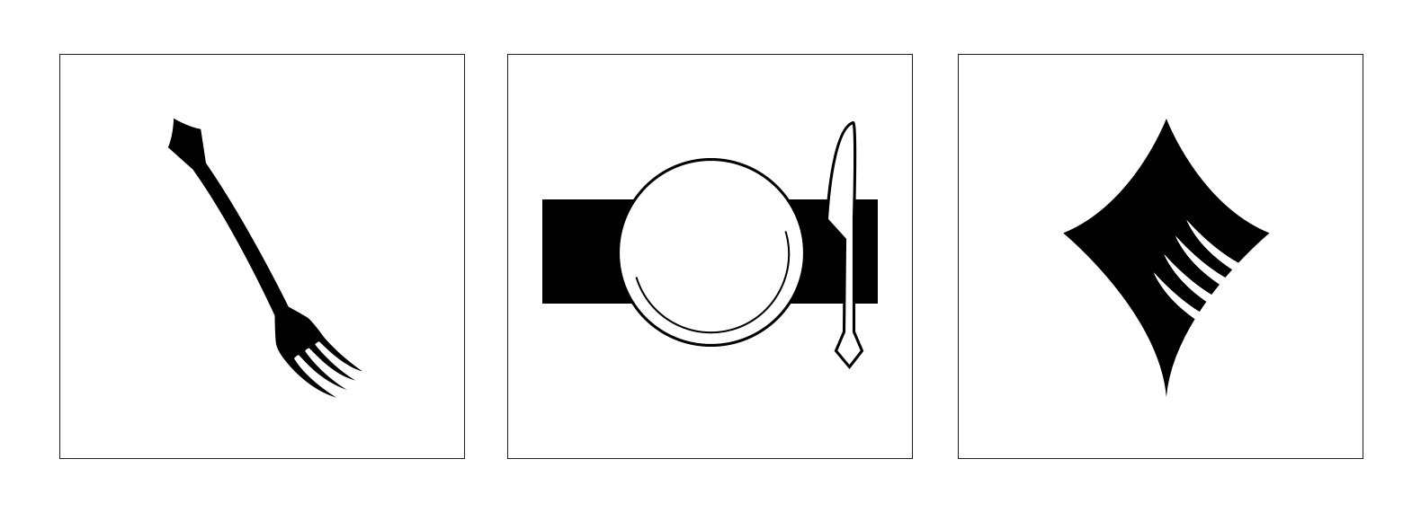
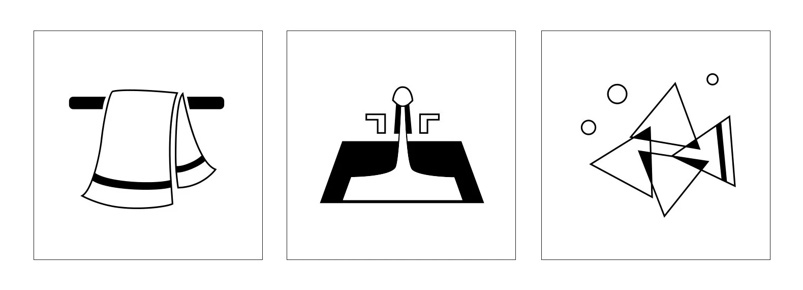
I made a set of three signs for two objects: a fork and a towel. The icon is the simplest representation of the actual object, the index implies evidence of the object without directly representing it, and the symbol is connected to the object through a culturally learned means (such as a brand logo evoking the brand without necessarily showing what the brand does).
All of the signs are vectors, created in Adobe Illustrator.
Fork final signs (left to right — icon, index, symbol)
Towel final signs (left to right — icon, index, symbol)
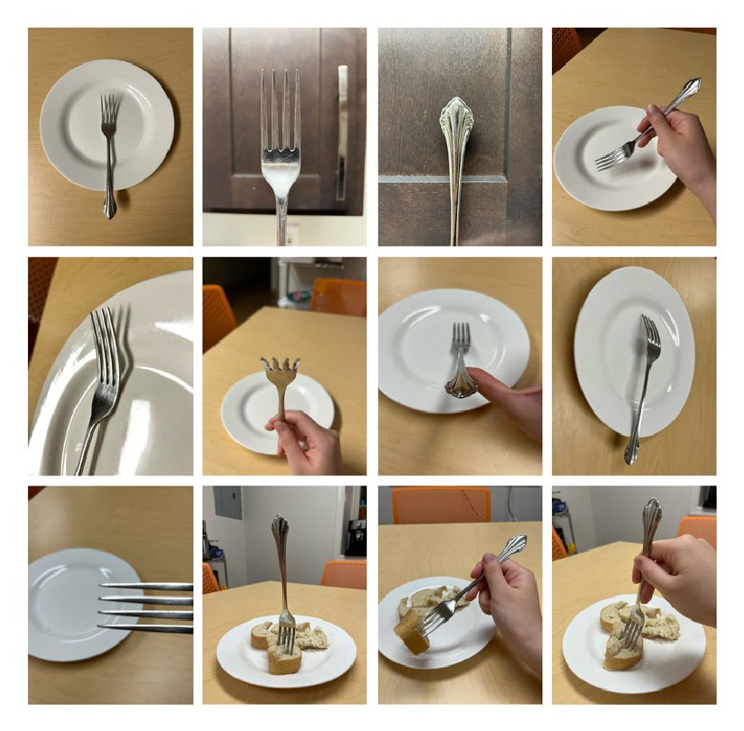
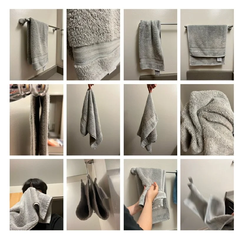
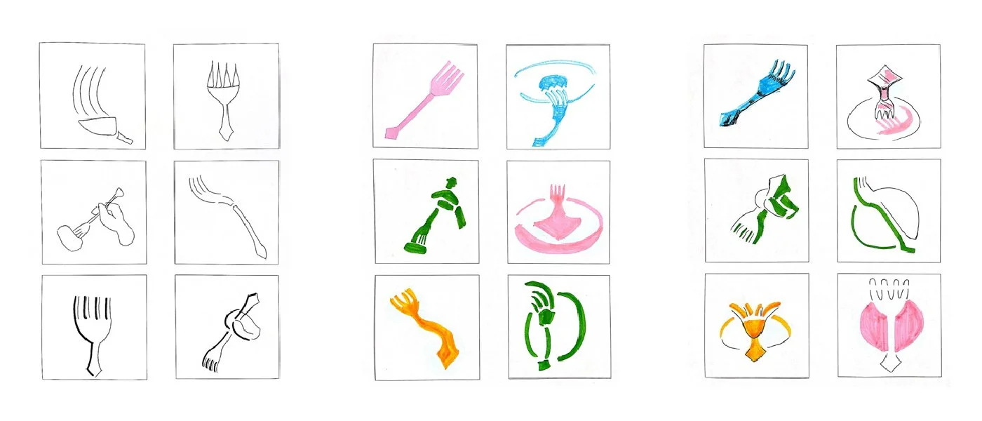
I started by studying the physical objects and photographing them from various angles. I also recorded the objects in use.
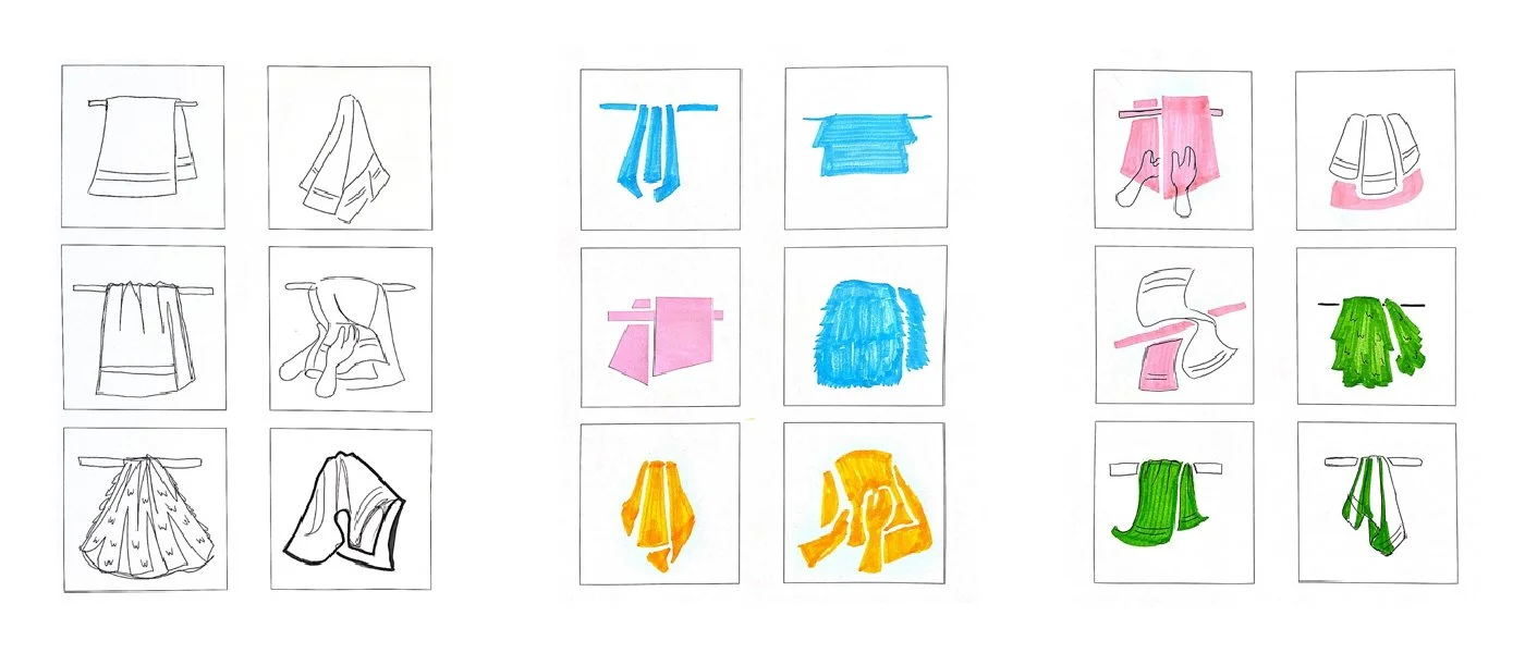
Next, I sketched six ideas for each sign. For the fork, I focused on the idea of a diamond shape, and for the towel, I played around with various shapes to show folds, and I ended up liking triangles the most.
In retrospect, my sketches for icon were not straightforward enough, and my sketches for index and symbol were too directly representative. However, I found a way to better proceed in the next step.
Fork sketches (left to right — icon, index, symbol)
Towel sketches (left to right — icon, index, symbol)
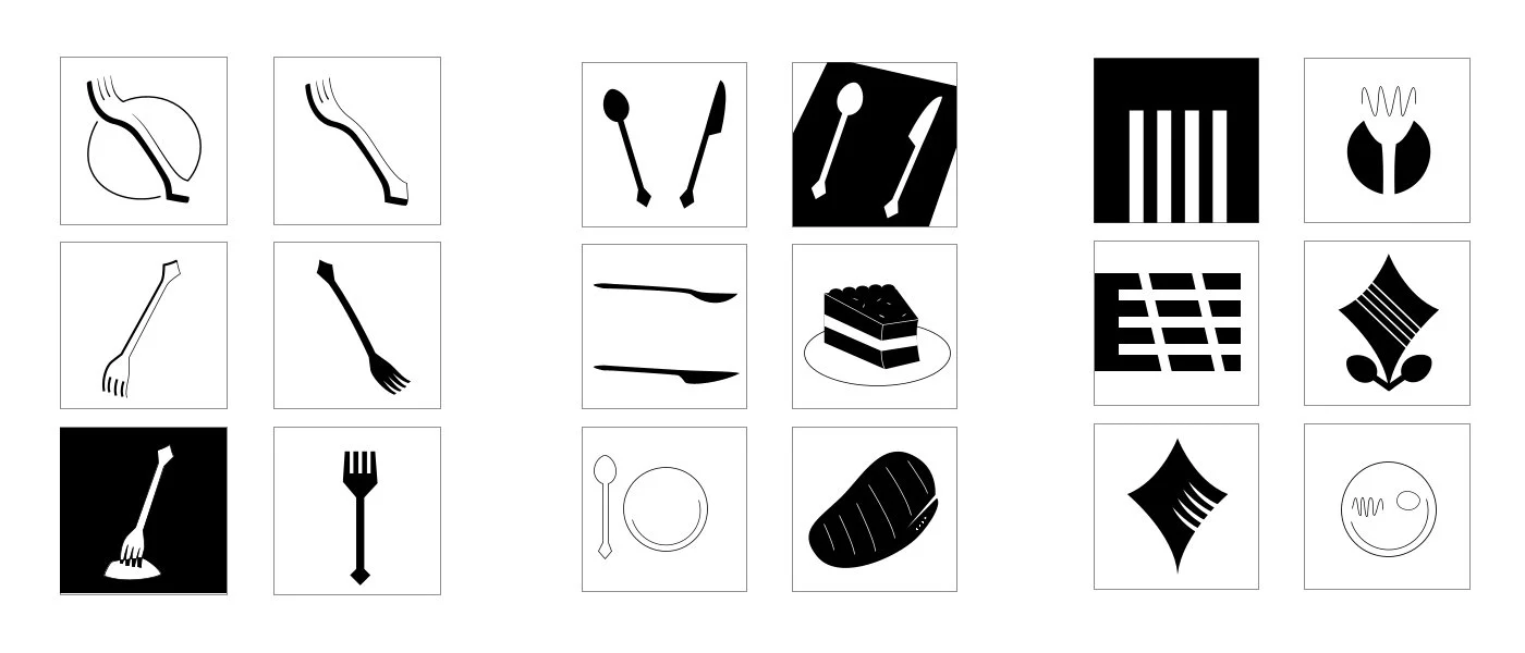
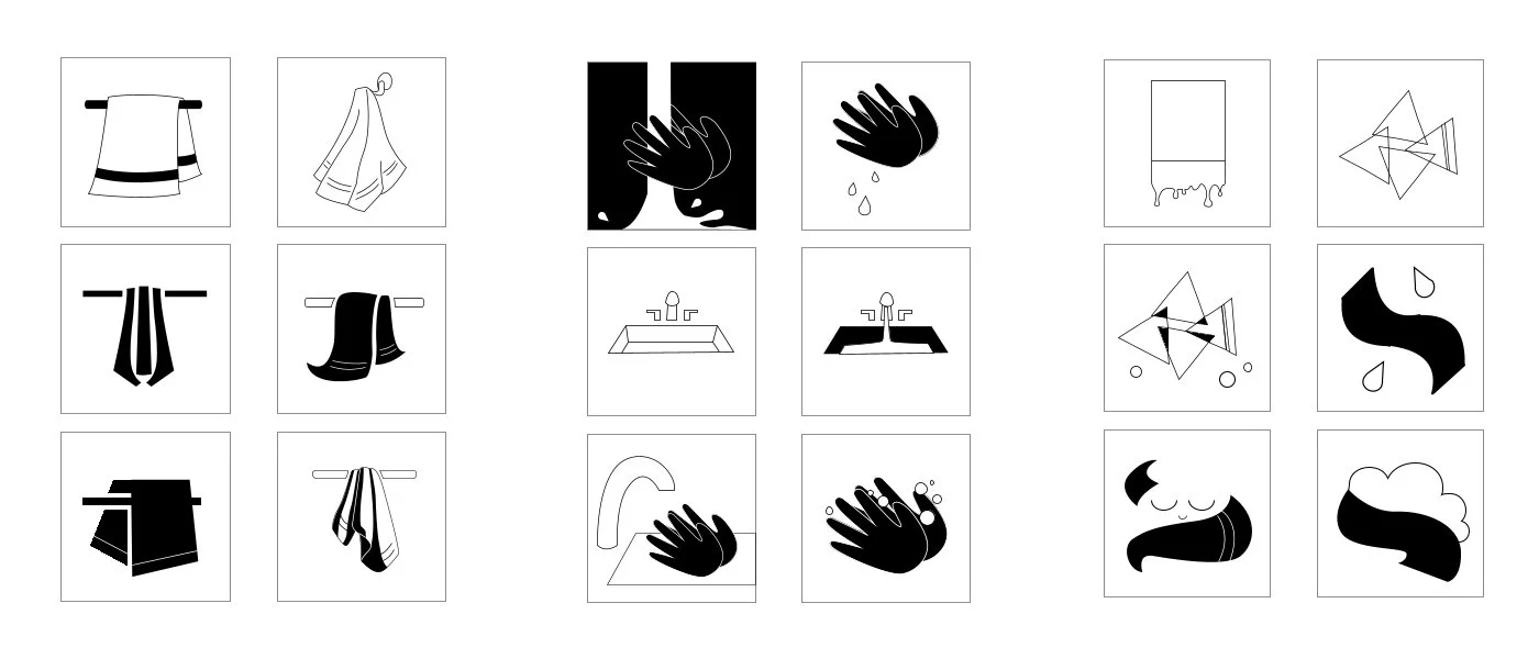
I brought some of the sketches to vectors, while also improving on my previous shortcomings by coming up with some new concepts as well. These vector sketches more accurately follow the constraints of the signs: the icons are more direct and less interpretative, the indexes only imply the object without showing them (eg. spoon, knife, and?), and the symbols are much more tangentially related to the objects.
Fork vector sketches (left to right — icon, index, symbol)
Towel vector sketches (left to right — icon, index, symbol)
Finally, I narrowed down the best vector sketches while considering how each of the three signs interacted with each other stylistically. I cleaned the vectors up to create the final lineup.

The icon is a simple fork silhouette, with one identifying feature: the diamond shaped back.
The index features a plate and knife on a wide tablecloth. Since a typical tableware setup features a fork and knife, the absence of the fork implies its existence.
The symbol takes the identifiable diamond-shaped back from the icon as a base and creates the shape of a fork tip through negative space. I intended for the diamond shape to bring to mind the shininess of metal, which communicates that the brand is clean and sharp.

The icon is a towel with a single black stripe at the bottom, hanging on a rack.
The index shows a sink with water running, and the perspective and linework form similar stylistic shapes as the icon. Additionally, the running water implies that a towel will be necessary.
The symbol uses triangles that overlap to create the image of a tropical fish, with a single black stripe on its tail to call back to the towel. My inspiration for the fish was based on how hotels often fold towels into animals for the guests; this symbol could be a logo for a tropical hotel.